
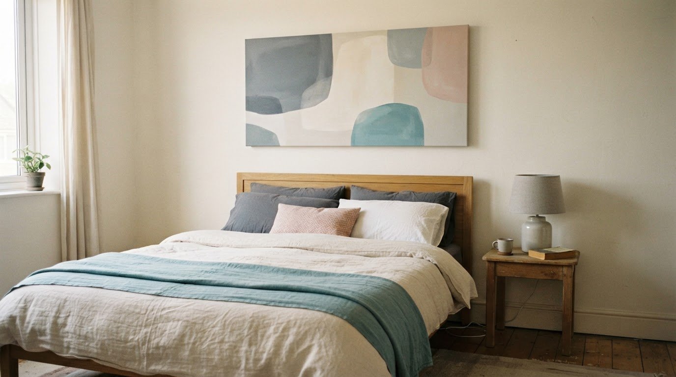
A restful bedroom wall doesn’t need a busy gallery. For calming wall art for a bedroom, choose gentle colours and a subject you enjoy seeing, then centre the artwork above the bed or bedside table. A useful starting point is to hang a print around 20-30 cm above the headboard, adjusting the position to suit your room.
It’s easy to focus on the picture and overlook its placement. Yet the right size, spacing and height help a wall feel balanced, whether you choose one statement canvas or a small group of prints.
This guide will help you choose bedroom art by colour and style, with practical ideas for hanging it above a bed or beside a bedside table. You’ll also find simple ways to make a gallery wall feel calm rather than cluttered. From soft landscapes and florals to abstract designs, a few thoughtful choices can make your space feel more restful.
Key Takeaways
- Choose minimalist or gentle abstract artwork with soft, muted colours to create a quieter feel.
- Hang artwork around 20-30 cm above the headboard, then adjust its position to suit the bed and wall.
- Use a small, coordinated group of prints for a gallery wall that feels restful rather than crowded.
- Match the artwork’s scale and style to the space above your bed or bedside table for a balanced finish.
What is the best calming wall art for a bedroom?
The best calming wall art for a bedroom usually has a simple composition, gentle colours and a subject that feels restful to you. Try soft abstract artwork with broad shapes, delicate lines or a muted landscape. A misty horizon, overlapping sage-green forms or pale blue brushstrokes can add interest without making the wall feel busy.
Minimalist prints suit bedrooms where patterned bedding or textured wallpaper already draws attention. Choose one clear focal point, such as a small group of leaves against a warm neutral background. For a quieter look, select abstract art with open space around the main shapes. If you want the wall to feel visually settled, avoid designs with sharp contrasts or crowded details.
Soft abstract artwork doesn’t have to be plain. Look for gentle colour transitions, rounded forms and repeated shapes, such as arcs or loose waves. These details add movement without creating a dramatic focal point. A limited palette can tie abstract bedroom art to cushions, bedding or a bedside lamp. Pick one accent colour, then let the rest of the image stay understated.
Renters can use removable picture-hanging strips suited to the artwork’s weight instead of drilling into the wall. Follow the product instructions and check that the strips are suitable for the wall surface, as adhesive can affect some finishes.
Before choosing a print, hold a paper template against the wall. This lets you compare its shape with nearby furniture and spot a design that feels too dominant. Keep the styling consistent: pair a soft abstract print with plain bedding, or place a minimal line drawing beside patterned cushions. The image should feel comfortable to look at from bed, not just attractive up close.
Artwork placement above beds and bedside tables
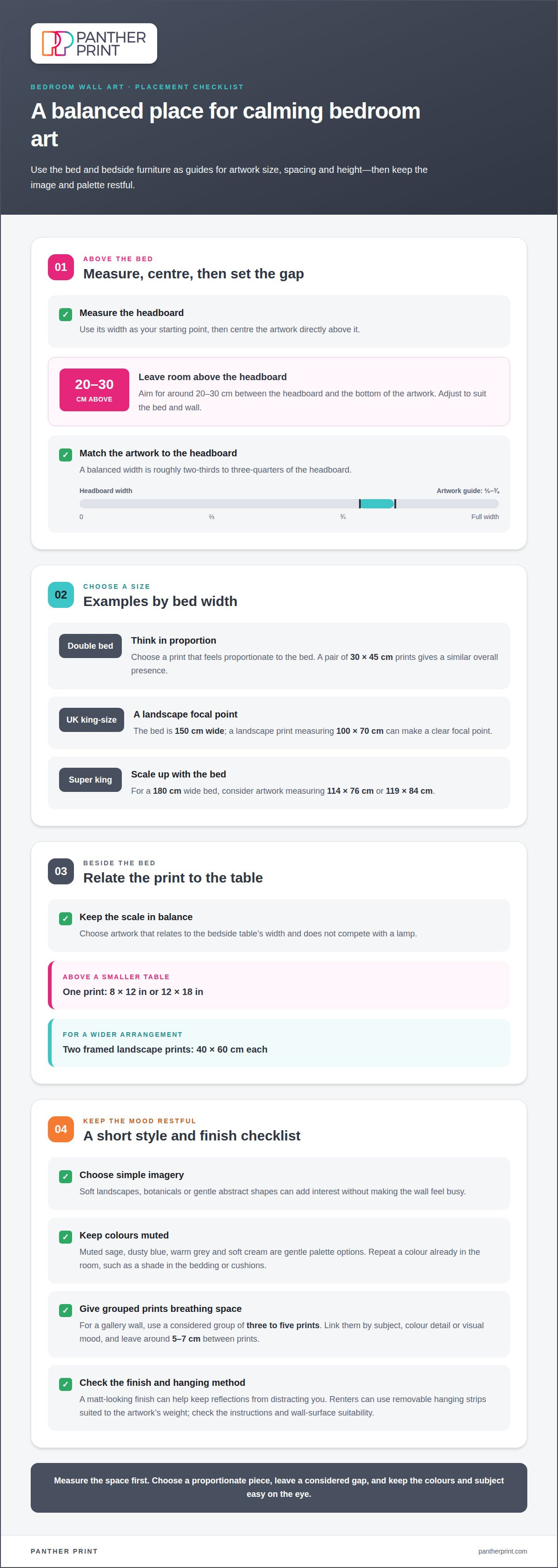
Start by measuring the headboard, then centre the artwork over it. Leave around 20-30 cm between the headboard and the bottom of the piece. This gap helps connect the print to the bed without crowding the wall. For a balanced look, let the artwork span roughly two-thirds to three-quarters of the headboard’s width.
Use the bed size as a guide, not a rigid rule. For a double bed, choose a print that feels proportionate to its width. A pair of 30 × 45 cm prints gives a similar overall presence. A UK king-size bed is 150 cm wide; a landscape print measuring 100 × 70 cm can make a clear focal point. For a 180 cm super king, consider artwork measuring 114 × 76 cm or 119 × 84 cm.
Beside a bedside table, choose a piece that relates to the table’s width and won’t compete with a lamp. A single 8 × 12 in or 12 × 18 in print can work above a smaller table. For a wider arrangement, two framed landscape prints measuring 40 × 60 cm create a more substantial feature.
Bring nature into the room with a soft botanical image, leafy branches or a quiet woodland scene. Coastal and seascape prints add gentle movement with pale skies, shorelines and water. Textured imagery, such as layered brushstrokes or rippling sand, adds depth. Keep the subject and colours simple so the wall feels relaxing rather than busy.
For calming bedroom prints, choose a matt-looking finish to keep reflections from distracting you, and a sturdy material that suits the room. The image’s finish and texture should support the restful mood, not overpower the scene. Explore landscape art prints for gentle horizons and nature-inspired views.
Low-saturation colours for a restful bedroom
Muted sage, dusty blue, warm grey and soft cream make gentle colour palettes for bedroom art. Pair these shades with quiet imagery, such as a still lake, leafy branch or abstract shapes.
Restful and gentle colour palettes
Start with a colour already in the room, such as the sage in a cushion or the cream in your bedding. Choose artwork that repeats it alongside a softer companion shade. Dusty blue with warm grey feels cool and settled, while terracotta softened with beige brings gentle warmth. Keep strong contrasts to small details so the main palette stays easy on the eye.
Relaxing colours and imagery
For a calming scene, look for a pale horizon, misty woodland or botanical study with plenty of open space. These subjects give the eye a simple focal point without crowding the image. Blended shapes and softened edges can create a similar effect in abstract art. Choose colours you enjoy seeing at bedtime: the most relaxing combination is personal, not a fixed formula.
Check how the artwork’s colours look beside your wall paint in daylight and lamplight. A blue print can appear cooler against bright white than beside warm cream. Hold a colour sample near the chosen spot, then compare it with the print’s main shades. This simple step helps prevent the palette from clashing with nearby bedding or curtains.
Build a collection around one shared detail, such as a sage accent, fine botanical lines or a hazy landscape. Two prints can feature different subjects and still feel connected through a repeated colour. Take inspiration from a room detail you already love, then look for artwork that echoes it without copying every shade.
Before choosing, name the mood you want: cool and airy, warm and earthy, or softly natural. Then select one dominant colour and one or two supporting shades. A pale blue seascape with cream highlights, for example, gives you a clear palette to carry through the bedroom.
Choosing bedroom wall art styles
Choose a style that relates to something already in the bedroom. A botanical print suits natural materials, while a simple black-and-white photograph can echo clean-lined furniture. For a peaceful finish, settle on one main visual direction before adding more artwork. This gives the room a curated feel without making every object match exactly.
A gallery wall can bring several favourites together, but keep the selection edited. Three to five prints make a considered group, with a shared subject, colour detail or visual mood linking them. For example, pair a leaf study with two landscape images that share a similar level of detail. Leave around 5-7 cm between prints to give each image breathing space.
Mixing styles works best when one element stays consistent. Combine a detailed botanical image with a softer abstract print, then repeat a frame colour or image tone. If every piece has a different subject, colour and finish, the wall can feel scattered. A single focal print may work better above a bed with patterned bedding.
Think about the room’s character, too. A coastal bedroom might suit calm seascapes, while a more personal space could feature travel photography or a favourite place. For a peaceful, collected look, choose images connected to your home rather than following a trend alone. Lay paper templates on the floor first to compare the arrangement before hanging.
Keep the final edit simple: remove any print that competes with the main image. Step back from the bed and check whether the wall reads as one arrangement or several separate statements. A small, curated group can feel more finished than filling every open space. Explore bedroom wall art styles to find a look that suits your room.
Panther Print
Panther Print offers canvas wall art to help you create a restful style in your bedroom. Once you’ve settled on the mood, colours and placement, explore the range to find artwork that suits your space.
Browse themes from abstract designs and landscapes to Animals & Wildlife and floral imagery. A quiet abstract piece can complement a gentle palette, while a landscape can create a peaceful focal point above the bed. Choose a subject and composition that feel right for your room, then use the placement tips in this guide to plan where it will hang.
For a more personal touch, Photo on Canvas lets you make wall art from a photograph that matters to you. Contact Panther Print to discuss your bedroom wall art.
Make your bedroom feel more like yours
Choosing calming wall art for a bedroom is also a chance to make the space feel personal. Pick an image connected to a place, memory or mood you want nearby, rather than choosing purely to match the bedding. That small personal detail can give the room its own character while keeping the overall look restful.
Panther Print’s range includes Abstract Canvas Prints, Animals & Wildlife and Art for Kids & Nursery Art, with different subjects to consider as you shape your space. Focus on an image you’ll enjoy seeing each day, then choose a position that feels right from bed.
Ready to find artwork that suits your room? Contact Panther Print about bedroom art and take the next step towards a more personal, peaceful space.
Frequently Asked Questions
What makes a bedroom feel truly relaxing?
A bedroom feels more relaxing when its colours, lighting and objects work together rather than compete for attention. Keep the bedside surface clear, use a warm bedside lamp and choose artwork with a focal point that’s comfortable to look at from bed. A softly coloured print, for example, can sit alongside plain bedding while patterned curtains remain the room’s main decorative feature.
What types of wall art create a calming atmosphere in a bedroom?
Choose imagery with a clear subject and gentle visual pace, such as a quiet landscape, a simple botanical study or softly blended abstract shapes. A photograph of a familiar place can also feel personal without adding lots of detail. Look at the image from bed: if strong lines, bright contrast or a busy subject immediately draw your eye, try a quieter design.
What size wall art suits a bedroom wall above a bed?
For a double bed, a single statement print around 60-80 cm wide can make a considered focal point. Treat that as a starting point, then compare the print’s width with the headboard and nearby furniture. A narrow headboard may suit a smaller piece; a broad wall can take a larger image or a balanced pair. Paper templates make the scale easier to judge.
How high should bedroom wall art be hung?
A practical starting point is to leave 15-20 cm between the top of the headboard and the artwork. Keep the gap visually connected to the bed, rather than placing the print high on the wall by itself. Before fixing it in place, sit or lie where you’ll usually view it. This helps you spot awkward glare, a blocked view or a position that feels disconnected.
How should wall art size relate to bed and furniture width?
Use the bed as your main reference, then check how the artwork relates to bedside tables, lamps and the headboard. A print that looks balanced over the bed may feel oversized above a narrow table. For example, centre a smaller piece above the table and avoid placing its edges where they seem to collide with a lamp or shelf.
How can I arrange multiple calming prints in a bedroom gallery wall?
Plan the layout on the floor before hanging anything. Choose one image as the anchor, then place supporting prints around it, balancing their visual weight. A shared frame finish, subject or colour detail helps the group feel connected. Try a loose grid for a tidy effect or an asymmetrical arrangement for a more relaxed look, keeping the overall shape centred above the furniture.